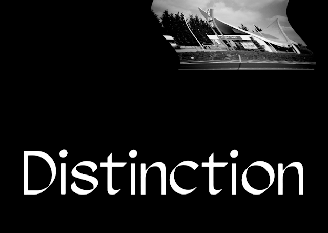
Drawing on the research gathered on the hyperbolic roof, concepts were generated for a series of printed posters that would reflect the structure and form of the building. The structure is now grade II listed, and three of the categories used to judge a building on its grade status are Architectural Distinction, Architectural Rarity, and Intactness. These three words are particularly poignant in regards to the current state of the building - as a structure it has become know for its distinct shape, and it is one of the last remaining examples of hyperbolic architecture in the UK. Now standing empty, there is an uncertainty to its future and a questionable longevity to its iconic form. These words formed the basis of the design experimentation for the poster series.
Typeface
To create a unique visual style for the project, a typeface was chosen to be used across all design material. The typeface Agentur, by Good Type Foundry was selected due to its unique letterforms. In particular the structure of the curved letters creates the appearance of a 3D stroke weight changing direction. This fits appropriately with the research undertaken on the physical shape of the hyperbolic roof, and will create a direct connection between the design work and the original form of the structure.
Colour
The most appropriate colour scheme for this project is black and white, as it reflects the current derelict state of the building, its fading history and its uncertain future. It also represents personal feelings of grief and creates. The colour red could also be used as a representation of the building's brief occupation by a Little Chef restaurant.
Primary Designs
Experimentation for the poster designs was undertaken using the selected typeface, a range of found imagery, and selected words and phrases gathered in the initial research phase.
Feedback on this initial experimentation concluded that the typeface was very appropriate to the context of the project. Peers commented that they preferred the edited black and white photos rather than the coloured versions, as it felt more representative of the themes of the project. While positive feedback was given to the warped text that mirrored the curves of the building, but some felt it was too obvious and didn't create any additional context.
Secondary Designs
Moving forward with this feedback, more attention was given to the type treatment. An aesthetic was developed using a gradient drop shadow that created a ghost like 3D appearance.
Feedback during a peer critique for these secondary designs was more positive, with many stating that the gradient drop shadow effect was very visually appealing, and created a unique style for the project. It was noted that the most successful design incorporated the more abstract imagery of the hyperbolic rood form, rather than the whole building. It was suggested that this style be expanded to incorporate the three key words from the research findings to create a triptych of poster designs. Although the colour red was appreciated within the context of the project, most found that the simplicity of the black and white created more visual impact.
Poster Triptych


