After collating this research my initial ideas stemmed from the synonyms of dependent:
My first idea was to create a typeface that 'clings' together or is connected in some way so that the letters are 'dependent' on each other. However after looking further into this idea I found that this would not be a practical font to create as each letter would have to connect infinitely with those either side of it, and would not be ideal for commercial use.
My next idea was a typeface that turned the meaning of the word upside down: in essence, a typeface that is strong, supportive and independent, and it is the user that is dependent on the typeface rather than the other way round. It would have to be flexible enough to be used across many different mediums, such as signage and headlines, so Helvetica was an appropriate typeface to use as a base. However I found this idea challenging to work through as Helvetica is already so effective and deeply integrated into design that I found it difficult to alter without reducing its impact.
After going back to my initial research into the definitions of 'dependent' I had the idea to create a typeface that would represent the french meaning 'to hang down'. This could be demonstrated through a typeface that would hang well below the baseline. I moved the baseline from the bottom of the letters to the top to give the impression of the words being 'dependent' on a top line and then elongated the x-height of each letter to give the impression of them 'hanging' down. I then furthered this idea by inconsistently changing the x-heights so that some were longer than others. I used the Univers typeface as my starting point for this idea because its even and consistent stroke weights would increase legibility when the letters were stretched.
Another idea that came from the word 'hang' was the idea of heaviness. I tried to create the idea of weight by changing the thickness of the strokes so they became thicker and heavier towards the bottom of the letters. However this was not effective as it began to look like a clichéd sixties 'flare' font.
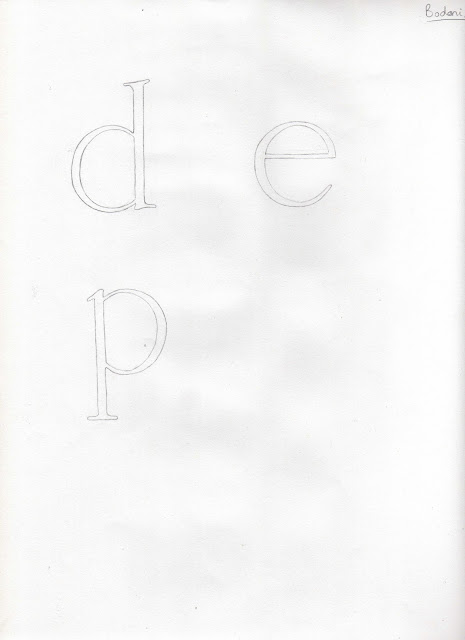
My fifth idea was to create a typeface that was 'inferior', 'secondary', 'lesser' or 'minor'; one that relies on the characters around it to be distinct, and would be used for copy text rather than headlines. A good starting point for this was Bodoni as the narrow strokes would be easy to adapt into a slender typeface. I started by reducing the thickest parts of the stroke weights so they were more consistent (top), but still felt there was too much detail, so I reduced the size and weight of the serifs also (bottom).
My first idea was to create a typeface that 'clings' together or is connected in some way so that the letters are 'dependent' on each other. However after looking further into this idea I found that this would not be a practical font to create as each letter would have to connect infinitely with those either side of it, and would not be ideal for commercial use.
My next idea was a typeface that turned the meaning of the word upside down: in essence, a typeface that is strong, supportive and independent, and it is the user that is dependent on the typeface rather than the other way round. It would have to be flexible enough to be used across many different mediums, such as signage and headlines, so Helvetica was an appropriate typeface to use as a base. However I found this idea challenging to work through as Helvetica is already so effective and deeply integrated into design that I found it difficult to alter without reducing its impact.
After going back to my initial research into the definitions of 'dependent' I had the idea to create a typeface that would represent the french meaning 'to hang down'. This could be demonstrated through a typeface that would hang well below the baseline. I moved the baseline from the bottom of the letters to the top to give the impression of the words being 'dependent' on a top line and then elongated the x-height of each letter to give the impression of them 'hanging' down. I then furthered this idea by inconsistently changing the x-heights so that some were longer than others. I used the Univers typeface as my starting point for this idea because its even and consistent stroke weights would increase legibility when the letters were stretched.
My fifth idea was to create a typeface that was 'inferior', 'secondary', 'lesser' or 'minor'; one that relies on the characters around it to be distinct, and would be used for copy text rather than headlines. A good starting point for this was Bodoni as the narrow strokes would be easy to adapt into a slender typeface. I started by reducing the thickest parts of the stroke weights so they were more consistent (top), but still felt there was too much detail, so I reduced the size and weight of the serifs also (bottom).
Despite this I felt that the letterforms as a whole were just too bold and still contained enough detail to be considered ‘independent’ by themselves. As a continuation of this idea I reduced the stroke weight again to a very fine, even line, and found that removing almost all of the detail was successful (top), but also removing the serifs entirely gave the most appropriate 'dependent' characteristic that I wanted (bottom).
Feedback from the interim critique was positive towards the idea of the typeface being dependent on itself and it was agreed that drastically reducing the stroke weights of the original Bodoni typeface was the most effective in terms of reflecting the adjective. There was also positive feedback towards the 'hanging' typeface, but it was pointed out that this didn't portray the face value of the word 'dependent', and therefore might cause confusion.


