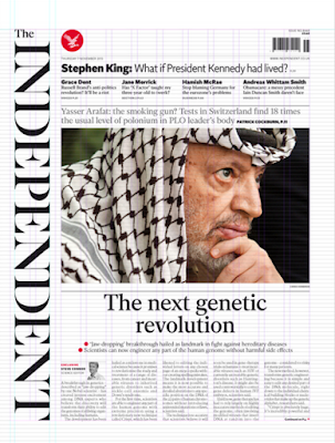
'The new design of the Independent's front page (above) is radical, elegant and striking. The vertical masthead allows the long logotype to be a prominent and unapologetic feature without getting in the way of the content'
'The composition includes a 12 column grid system, which allows photographs and copy room to breathe.' It provides a consistent form of structure that is transferable throughout every page of the newspaper and delivers a continuity that is recognisable and familiar to its readership. In order to demonstrate this, as a group, we each took a page from a recent edition of the newspaper and drew out the grid system according the the theory stated in the redesign.


