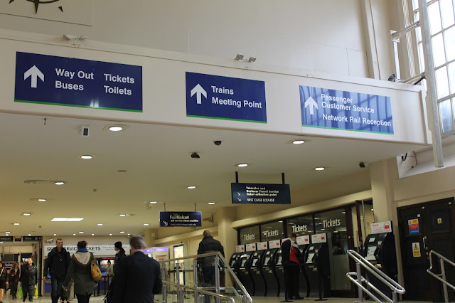
The train station in Leeds is owned by Network Rail, one of eighteen run and maintained by this company. It is one of the most well signposted public areas in the city and contains some of the most recognisably designed signs.
There are only three types of signs within the station: wall signs, ceiling signs and free-standing signs on the platforms. All signage throughout every station under Network Rail follows are a strict design strategy - white type, arrows and symbols on a navy blue background with a coloured stripe at the bottom of each sign. The signs in Leeds have a green stripe, whereas Edinburgh Waverley, Liverpool Lime Street and Reading are blue, Glasgow Central is yellow and Manchester Piccadilly is purple, each relating to it's position in the country. All text, arrows and symbols on signs that indicate an exit are highlighted in yellow.

One of the only exceptions to the signage is the banner for the self service ticket machines. In Leeds Station it contains black text on a white background, but this can differ from station to station as these machines are run by different companies.
There are also a specific set range of symbols and pictograms used within all Network Rail stations. There are a total of eight different arrows used on signage to indicate the direction of both platforms and other facilities - up, down, left, right, and each of the four diagonals in between. There are standard symbols used to indicate toilets, lifts, bicycle gates, and disabled, family and pushchair entrances and exits. Also within the main concourse is a central meeting symbol. Information points are indicated with an 'i' enclosed in a white circle, and parking is indicated with a 'p' enclosed in a white square.
The signage extends beyond the station itself, to Metro bus stations which are indicated with its red circle symbol, and taxi ranks and luggage racks.
Visible even over large crowds, the signage at Leeds Station's is recognisable almost to the point of being iconic. It is minimal while still being as clear and concise as possible, and the consistency of the green banding provides a link between all signage, making it highly effective for both navigation and recognisability.


