Tuesday, January 12, 2016

OUGD405 - Studio Brief 02 - Public Information Leaflet Final Design

Photographs of the final physical leaflet and stickers:


The leaflet was print on IPRINT Digital Silk 300 gsm paper and laminated to enable the stickers to be applied and removed without damaging the leaflet itself. The stickers were originally printed on two different types of sticker paper - a matte white paper and a clear plastic sheet - but the final stickers that were used were the plastic versions, as they would be more durable when used by children.

Feedback from the final critique for this public information leaflet was largely positive. In order to gain a wide variety of feedback I targeted specific groups of people, some with younger siblings and some without. It was agreed by both that the designs were more obviously engaging to a young audience, rather than to teenagers, and the level of interaction would be appropriate for the audience (children aged 3-5). The leaflet was also appropriate for its intended distribution within schools: it would allow young children to learn the Green Cross Code in a learning environment, but would also allow them the option to take it home to show and learn with parents. If children did not have access to the leaflet through a school, it would also be appropriate to send out to families via post, although if this was the case, a specially designed envelope would also have to be created to allow for its particular shape and thickness, and its small parts.

After finalising my designs, I also consulted with the head teacher of a first school in regards to the use of colours, typefaces and content. It was agreed that the overall style of the leaflet felt appropriate for the audience, and that intentionally creating a leaflet for children of ages 3-5 allowed for more audience-specific content. The colours were engaging, and the distinction between the red/blue side and the green side created a clear definition between information and instruction, and practice. The typeface would be legible to young children at the used pt size, and the use of a smaller typeface for the adult instructions allowed more information to be printed without creating a distraction for the younger user. A problem was identified with the size of the stickers, as some children with disabilities that affect movement and dexterity could find them too small or difficult to apply and remove. However, the additional online game created a solution to this as it would allow these children a different way of learning that was more appropriate to their abilities, as well as allowing all users to continue learning and using the game outside of the leaflet, outside of a school environment, and in their own time.

I used Adobe Illustrator to create the entirety of my leaflet as the vector graphics allow any and all images to be rescaled to any size within the programme without pixelation, meaning any editing or transferring of the designs can be done without the loss of quality.

The physical version of the leaflet that would be sent out would have an altered folding pattern, with the fold that creates the front cover being re-creased 5mm towards the centre of the leaflet. This would ensure that the Green Cross Code design on the front cover would be central. However at the time of creation only one leaflet could be laminated, due to semi-functional machinery, and so only one final version of the leaflet could be produced.

OUGD405 - Studio Brief 02 - Online Game

In addition to the leaflet I created an online version of the game to help children continue learning the Green Cross Code. It was created with the idea that they could play it in their own time, either with or without a parent, so that crossing a road becomes something more than a classroom lesson. The game would involve moving cars and bikes, and the player would select a character for themselves and a parent character to help them cross. They would then select the places that they think are safe to cross, and then press a button to indicate when they would cross the road safely.


Monday, January 11, 2016

OUGD405 - Studio Brief 02 - Sticker Sheets

To create the designs for the sticker sheets I used Adobe Illustrator to trace over my original sketches. I create six cars in total, three facing left and three facing right. I used the same colour scheme as for the rest of the street in order for the children using it to easily associate the 'dangerous' cars and bicycles with a 'dangerous' road environment.


In order for the children to demonstrate how they would cross the road I created a series of character that they could use. I created two children and two adults, with the intention that the user could choose a character that represented them, and that they would always have to pick an adult figure to help them cross safely. I did not create initial sketches for these characters as I wanted them to look as freehand as possible in order to successfully copy a child's style of drawing. I created them entirely on Adobe Illustrator.


In addition to these stickers I also created some simple fastening stickers to hold the leaflet together when being posted, using the same colour scheme and silhouetted shapes.


Sunday, January 10, 2016

OUGD405 - Studio Brief 02 - Public Information Leaflet Side 2

Again using Adobe Illustrator for the outside of my leaflet, I used my original sketches as a guide line, creating a wavy 'road' motif that connected all three sections. I used the silhouetted shapes of the cars and bicycles I'd already created for the stickers to add detail to the background. Using the red and blue colours from the inside of the leaflet, I found three shades of green in similar tones.


I selected a range of typefaces to test which would be the most appropriate for the leaflet, including Gill Sans Ultra Bold Regular, Helvetica Neue Condensed Black, Source Sans Pro Black and Vag Regular. I finalised the typeface as Source Sans Pro because it is legible at both small and large type sizes, and it's thicker weight create a greater contrast against a background, again increasing legibility for small children. The main body of the text is coloured in the darkest green to provide contrast to the background design, but I introduced black coloured type for a section of writing specifically for adults, in order to help differentiate the important information for the adults, and also to make it somewhat less appealing for children.

Originally, I wasn't going to include many, if any, facts or figures within the leaflet, as typically small children would not understand the context of these, but considering the object of the leaflet is to educate young children on the dangers of busy roads I included the number of pedestrian child deaths caused by cars, but using child friendly wording.


OUGD405 - Studio Brief 02 - Public Information Leaflet Side 1

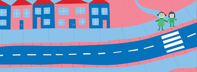
To create the inside of my leaflet digitally I scanned in my sketches and traced over them using Adobe Illustrator. In order for the illustrations to connect with a young audience I wanted to emulate their style of drawing, using simple, non-uniform shapes and as little detail as possible. I wanted the colour palette to be minimal but also engaging so I selected a bright red and a bright blue, and from these a sky blue and a pale pink, as according to child pyscology, red is the most engaging colour, and blue and pink are the most calming.


Friday, January 8, 2016

OUGD405 - Studio Brief 02 - Final Design Sketches and Mock Up's

Having chosen my design I sketched out the layout of the leaflet in further detail, including the designs of possible accompanying stickers:

inside of the leaflet depicting the street scene


outside of the leaflet, including front page, the Green Cross Code, and instructions for the game


sketches of cars and a bicycle


Information to include within the leaflet:

The Green Cross Code:
1) Always remember to walk with an adult
2) Find a safe place to cross away from parked cars - use the traffic lights or the zebra crossing if you     can!
3) Stop just before the curb
4) Look all around for traffic and listen
5) If traffic is coming, let it pass
6) When it is safe, for straight across the road - do not run!


Instructions for the game:
Children: Pick a character and help them cross the road safely! Always remember to use the Green Cross Code!

Adults: Help your child learn how to cross a road safely by placing the stickers on the road to create a real-life scenario. Start with light traffic and gradually make it heavier. Traffic can be moving or stationary. Guide them through the Green Cross Code, helping them identify the dangerous and safe places to cross.


Fake website address where they can play an interactive online version of the game: www.think.gov.uk/greencrosscode


Fact: 1,379 children were killed on the roads in 2015

Wednesday, January 6, 2016

OUGD405 - Studio Brief 02 - Public Information Leaflet Initial Ideas and Mock Up's

Stemming from my analysis of the public information video and my research I had several initial ideas:

The original 'SPLINK' video used the actor Jon Pertwee, a former Doctor Who star, so an idea appropriate to children could be a 'super-hero' style comic strip showing a cartoon version of Doctor Who in the TARDIS. He would teach children how to use the Green Cross Code to help them cross the road.


a mock-up for a single sided leaflet


The second idea was a three-layer fold out leaflet depicting a street scene that would reveal more facts as it unfolds. This could also incorporate pop-up cars or pop-up children as it is unfolded.

a three fold leaflet depicting a street scene


Another similar idea was to have a fold out leaflet depicting a street scene. The leaflet would come with a variety of stickers and children would be able to place cars and bicycles on the road and then identify the dangerous and safe places to cross, using the Green Cross Code to help them.


a mock-up of the street scene inside of a three fold leaflet


Some other ideas for leaflets that would be aimed at adults included a mock letter from a hospital describing how their child might be hit by a car in the future if they do not fully understand the Green Cross Code and how to use roads safely. It would begin to describe details of the accident before segueing into how a parent might teach their child about prevention methods for accidents. Another leaflet could be in the style of a letter handwritten by a child about how they like to play on the roads and in between cars, with the message that this would not be the kind of content that a child might write, and is not something a child should be writing about. However, in hindsight, these ideas could be potentially confusing for people who receive the letter and do not have children, or for people who do not read the leaflet fully as there is not direct and clear message.

In a similar style, a leaflet could be sent out that appears to be written by a child that simply depicts the rules of the Green Cross Code. This would have the intention of being placed around the home, such as on a fridge or on a wall as any other child's drawing might be, in order for a child to see and be aware of the Green Cross Code in every day life.


a mock-up of a child's handwritten 
version of the Green Cross Code


After an interim critique in which I discussed all of my ideas with several groups of students it was agreed that a leaflet with stickers would be the most engaging for a young audience, and would allow both children and parents to interact with the leaflet together to maximise the opportunities for learning.

OUGD405 - Studio Brief 02 - Public Information Leaflet Further Research

Furthering this research, I also looked at more modern examples of leaflet and brochure production. Many, if not most, of the leaflets utilised folding as a unique feature of the design:


concertina fold leaflet


concertina fold recipe leaflet


origami style, self-contained fold


a single sheet folded into a newspaper spread to maximise the content:space ratio


folded magazine spread that creates its own packaging


a folded leaflet inside a separate posting box


a menu with interactive illustrations


an interactive illustrated children's book with pull-down flaps


For my target audience to be able to use the leaflet effectively I decided to exclude the use of the more complicated folding techniques. However, a degree of interactivity would help engage young children and a fold-out design would emulate a story book, actively encouraging them to open and engage with the leaflet. This could be done through, pop-up sections within the leaflet, tabs that could be pulled of spin-wheels that could be turned. Bright colours in a simple and refined palette would be the most appropriate for the age range, and the written information should be clearly displayed and as concise as possible.