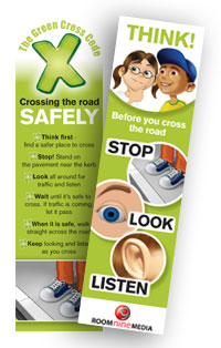
The Green Cross Code Man underwent several transformations throughout the 1970's and 80's, from the use of celebrities endorsing the message to a 'superhero' style comic strip.
From the early 2000's and onward the 'green cross code' title gradually fell into disuse and was replaced by a multitude of other, although rather similar, slogans all including a message along the lines of 'stop, look, listen'.
All of these promotional materials were marketed towards 'young children', however this ranged from ages 3 -16, with many of the materials aiming to connect with all children within that 13 year bracket. All use a similar authoritative but simple tone of voice and draw on the naivety of very young children. This is ineffective marketing as within a large audience such as this, there are many very specific smaller groups that have their own needs, such as use of illustrations, tone of voice, volume of information. From this I concluded that it would the most effective to design an information leaflet for a particular age range, keeping their specific requirements in mind. I wanted to focus on children aged 3-5, as this is the time when they are beginning to start school and are able to walk with their parents on roads.
In order to gauge what level of content would be needed for children I looked at children's books targeted at this age range. The most common included: The Very Hungry Caterpillar, the Dr Seuss series, Where The Wild Things Are, The Gruffalo, The Tiger Who Came To Tea and We're Going on a Bear Hunt. Most of these titles are heavily illustrated, but contain a minimum amount of words per page, meaning these children are capable of taking in relatively large amount of visual information, but do not necessarily rely on the written content in order to understand what they see. In terms of colour use, some of these books contain life-like illustrations, whereas others are entirely fictional, and use an elaborate range of colours to portray another world - colour does not have to be true to the scene and the same applies for any material a child might use and look at. The text within children's books is written clearly, with high contrast, and uses typefaces similar to that of Times New Roman.
The Gruffalo, Julia Donaldson
The Lorax, Dr Seuss


