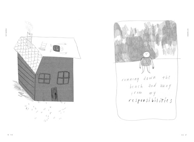
A basic grid system was created that incorporated page numbers and initials of the featured artist in the bottom outer corner of each page and a tag-line featuring the name 'Shy Bairns' on the outer edge. The page numbers and initials would feature on every page whereas the tag-line would only be printed on pages that feature more simple work so as to retain the integrity of the work as far as possible. Both components would be printed in either a complementary colour or in white over coloured sections of the work.
Images and text would be contained mainly within the sections identified by the grey boxes, with the only exceptions being full bleed images.
Grid system
Example spreads taken from the publication
Feedback for these layouts from both the group and a peer critique was positive. It was noted that the layouts were minimal and therefore clear and allowed the submitted work to become the feature of the spread.
Additional pages including a content page, credit pages and an introductory interview spread were then also created alongside the content produced through submissions.
Connecting with Footprint was an important step in defining the specifications for the publication. After contacting them they defined that the document created for printing would need a 10mm top margin, a 10mm out margin, a 15mm bottom margin and a 20mm inner margin. The inner margin is required to be slightly larger as at least 10mm of the page will be used to create the perfect bind. The document was also required to have a 3mm bleed.
The typeface used within the content pages of the publication is Gill Sans. This was chosen because of its sans-serif forms, which gives the publication a modern and approachable feel compared to other available text zines.
The publication was created to these specification within the proposed deadline for production. It was then sent to Footprint for proofing and printing. A full greyscale version of the publication is shown below:
Shy Bairns Volume 1 Greyscale by Erin Blamire on Scribd


