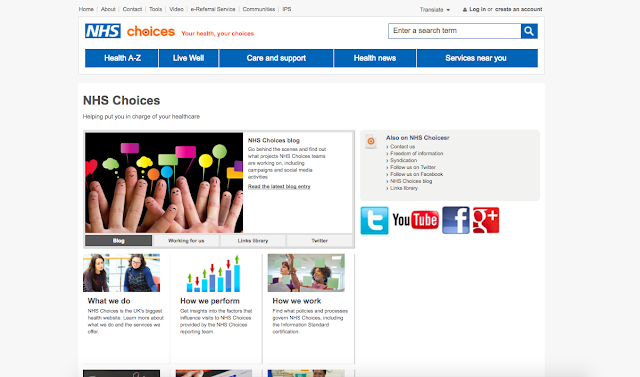
The current NHS website incorporates a relatively successful design. As a health service website, there is a large volume of information across many different areas that needs to be displayed. The website as it stands uses a clearly defined grid system to separate the information, which makes navigation easy. However, the type sizes vary dramatically and are often too small in relation to the size of the website, making parts of the text inaccessible to some users.
The aesthetic of the website is overarchingly professional, which accruately reflects the values of the company, however this can also be interpreted as 'corporate' and unattractive, and can lower the experience of the user as a result.
As of September 2016 the NHS announced its plans to move towards a paperless NHS, with the hopes of developing apps that would allow patients to book appointments, check test results, and enter symptoms online and receive tailored advice or a call back from a health professional. The NHS states that they recognise they can connect health services with smartphones and apps, a move which a report has suggested could put £4.4bn back into the NHS. This app could act as the first example of the integration of technology into the non-emergency services.


