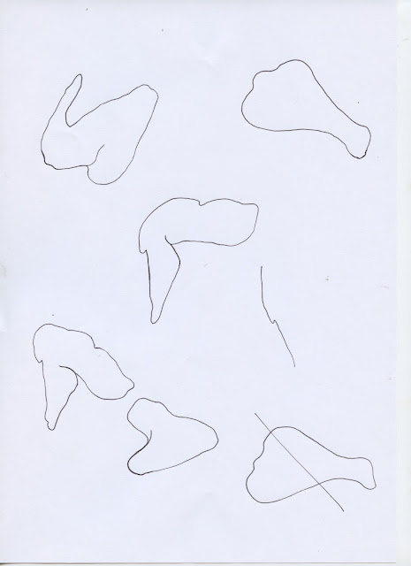
In order to inform the letterforms of the typeface, research was also undertaken into the forms of chicken wings and drumsticks. A selection of stock images were taken from google images.
Research Images
Sketches
Before any letterforms were created it was first discussed how the alphabet would look. Comparing the forms of traditional letters, it was found that many letters could be paired or grouped. For example: 'm' and 'n'; 'b', 'd', 'p' and 'q'; 'A' and 'V'; and 'i' and 'j' share many similarities, and could therefore use similar, if not the same, chicken wing shape. This system was also used for the numbers: 3/8; 1/7; 6/9; and punctuation:./, and :/;.
It was agreed that the fastest way to accurately create the full set of letters, numbers and punctuation was to use the stock images as a guide and trace the outlines of the chicken wings. From the selection of stock images it was possible to find all of the forms needed to create the alphabet. It was also agreed that in order to create some of the letterforms, it was necessary to incorporate the use of chicken drumsticks, popcorn chicken balls and chicken bones. Peer feedback on this decision indicated that it created a more legible and diverse typeface, and opened up more possibilities for future used.


