Create a logo for the zine distribution company Lonely Boy. The logo must embody the ethos of zines and the DIY community while also appealing to a young, digital and a socially aware generation. The logo will be used primarily across the Lonely Boy website and social media outlets, but a range of physical merchandise can also be considered (t-shirts, tote bags, posters etc).
Background
Lonely boy is an online zine distro founded in 2017 by Georgia Gibson and Izzy Kroese, and they approached me to create a logo for the company. As the company currently exists only digitally, strong and memorable branding is key to helping solidify the presence of their online shop and build an audience across their social media platforms.
Audience
The brief indicated that the branding should appeal to a young, digital audience. The name itself is a reference to a character in the popular American TV series Gossip Girl. It is also a reference to emo culture, and a device used to connect with the distro's primary target audience - 18-28 year olds who are either part of, or aware of, both zine and emo counter-cultures.
Primary Designs
It was specified that the logo should ideally be a wordmark, rather than a symbol. Keeping in mind the intended audience, a selection of initial type-based designs were created using a variety of basic but unique typefaces:
A retro typeface reminiscent of the early type used on the first computers that creates an instant connection with the many different online platforms that exist under the brand's name.
A modern, open and highly legible sans-serif typeface that would easily translate across digital platforms
A gothic script typeface that reflects both the emo subculture and recent trends in typography within design
A brush-effect script that reflects the DIY nature of zine culture
A weighty, all-caps sans-serif typeface that would create the desired strength within the brand
Feedback
Secondary Designs
This logotype was then refined through a selection of secondary iterations:
The decorative stems were removed and a stroke was added to add extra weight to the narrowest parts of the letterforms, which allows for increased legibility at smaller scales.
Two warped versions of the logotype - further discussion with the client revealed that the logo would also be used across physically printed merchandise (t-shirts, tote bags, etc). Furthering this idea and replicating the movement of fabric, the warped letters create a sense of dynamic - even on flat surfaces the logo appears responsive to its environment.
Feedback
Feedback towards the warped logos was extremely positive from both peers and the client. It was agreed that the type treatment was appealing and highly appropriate for the target audience, and created a unique and recognisable brand for the distro. Out of the two versions, the second was preferred due to its cleaner appearance. It was noted that legibility had been increased through the alteration of the typeface, but had not been compromised by the warped letters, and therefore the logo would function well at all scales across digital and printed material.
In addition to this it was requested that the full name of the distro be added.
Final Logo
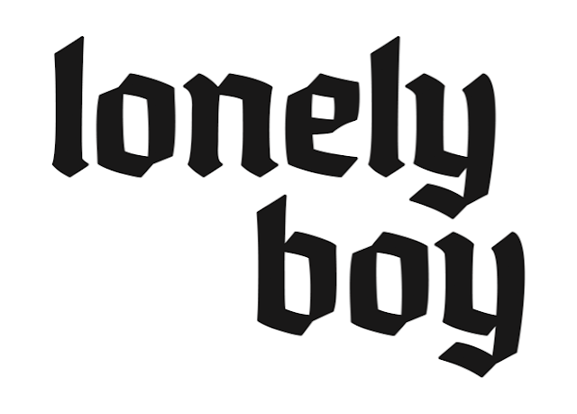
The finalised version of the logotype, including the full name of the brand:
Tote Bags
As a designer with knowledge and access to screenprinting facilities, I was also asked to create a short run of printed tote bags for the company. A variety of options for tote bags designs were created in mock-up, and it was decided that the full bleed edge-to-edge design created the most impact and showcased the new logo well.
The tote bags were printed in the Blenheim Walk fabric screenprinting room in a run of 50:
The branding produced within this brief is highly successful. The logo is distinctive and modern. Although many of the design decisions play on current design tropes, the aesthetics of these are highly suitable to the context of the brand and its target audience. Working closely with the client allowed design decision to be made quickly, and therefore productivity over the course of the project was consistently high. Expanded from digital platforms into physical merchandise allowed for a greater consideration as to the wider applications of the brand. Further consideration was given to the logistics of mass production, and skills for fabric screenprinting were greatly improved.
In addition to this it was requested that the full name of the distro be added.
Final Logo
The finalised version of the logotype, including the full name of the brand:
Tote Bags
As a designer with knowledge and access to screenprinting facilities, I was also asked to create a short run of printed tote bags for the company. A variety of options for tote bags designs were created in mock-up, and it was decided that the full bleed edge-to-edge design created the most impact and showcased the new logo well.
The tote bags were printed in the Blenheim Walk fabric screenprinting room in a run of 50:
Evaluation
The branding produced within this brief is highly successful. The logo is distinctive and modern. Although many of the design decisions play on current design tropes, the aesthetics of these are highly suitable to the context of the brand and its target audience. Working closely with the client allowed design decision to be made quickly, and therefore productivity over the course of the project was consistently high. Expanded from digital platforms into physical merchandise allowed for a greater consideration as to the wider applications of the brand. Further consideration was given to the logistics of mass production, and skills for fabric screenprinting were greatly improved.


